Flex入门教程
采用 Flex 布局的元素,称为 Flex 容器(flex container),简称”容器”。它的所有子元素自动成为容器成员,称为 Flex 项目(flex item),简称”项目”。
基本概念
采用 Flex 布局的元素,称为 Flex 容器(flex container),简称”容器”。它的所有子元素自动成为容器成员,称为 Flex 项目(flex item),简称”项目”。
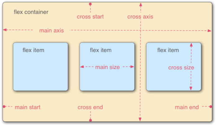
容器默认存在两根轴:水平的主轴(main axis)和垂直的交叉轴(cross axis)
容器的属性
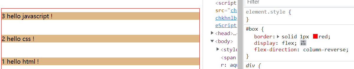
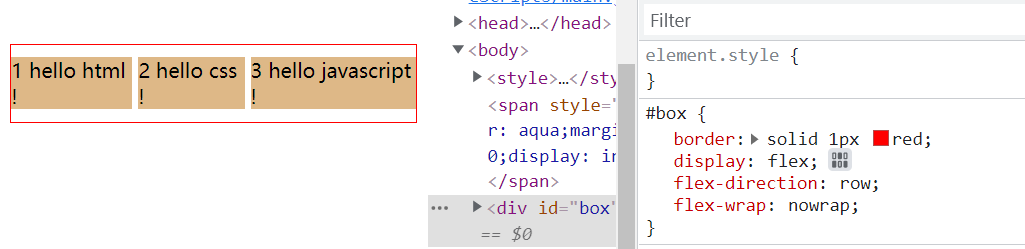
flex-direction
1
2
3
4
|
div {
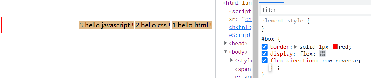
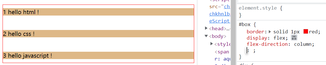
flex-direction: row | row-reverse | column | column-reverse
}
|
设置效果如下:
示例代码如下:
1
2
3
4
5
6
7
8
9
10
11
12
13
14
15
16
| <style>
.item {
margin: 10px 0;
background-color: burlywood;
}
#box {
display: flex;
flex-direction: row;
}
</style>
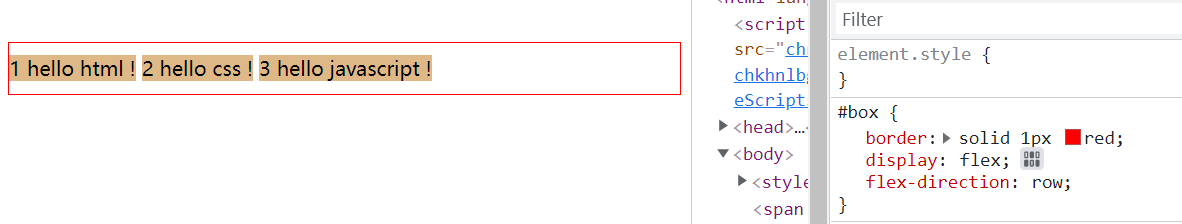
<span style="background-color: aqua;">flex-direction: row</span>
<div id="box">
<span class="item">1 html</span>
<span class="item">2 css</span>
<span class="item">3 javascript</span>
</div>
|
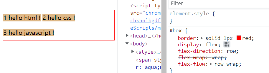
flex-wrap
1
2
3
4
5
|
div {
flex-wrap: nowrap | wrap | wrap-reverse
}
|
宽度不够时:
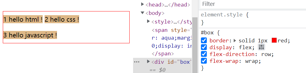
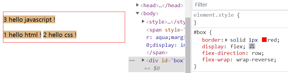
示例代码如下:
1
2
3
4
5
6
7
8
9
10
11
12
13
14
15
16
17
18
19
20
| <style>
.item {
margin: 10px 0;
background-color: burlywood;
}
#box {
border: solid 1px red;
display: flex;
flex-direction: row;
flex-wrap: nowrap;
}
</style>
<span style="background-color: aqua;margin-bottom: 10px;display: inline-block;">
flex-wrap: nowrap
</span>
<div id="box">
<span class="item">1 hello html ! </span>
<span class="item">2 hello css ! </span>
<span class="item">3 hello javascript !</span>
</div>
|
flex-flow
flex-flow是flex-direction和flex-wrap的简写形式
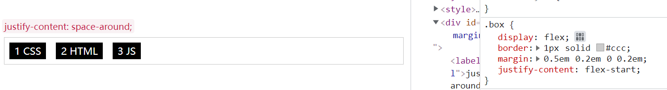
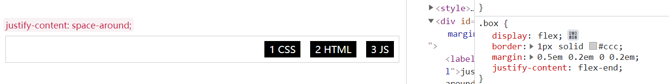
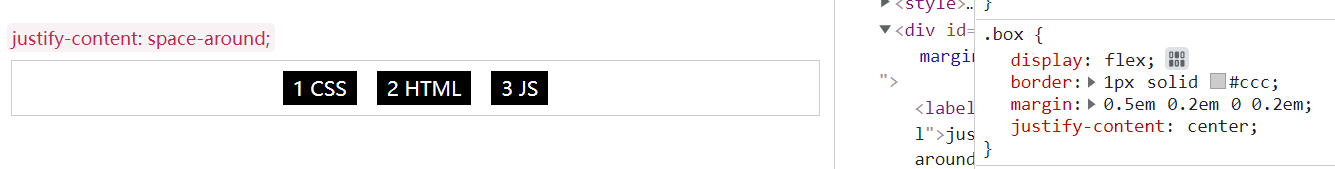
justify-content
定义了项目在主轴上的对齐方式
1
2
|
justify-content: flex-start | flex-end | center | space-between | space-around | space-evenly;
|
- flex-start(缺省): 从起点开始排列
- flex-end: 从终点开始排列
- center: 居中排列
- space-between: 项目均匀分配,第一项在起点线,最后一项在终点线
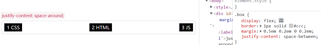
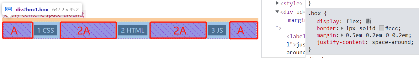
- space-around: 项目均匀分配,每个项目两侧有相同的留白空间A,所以相邻项目之间的距离是两个项目之间留白的和
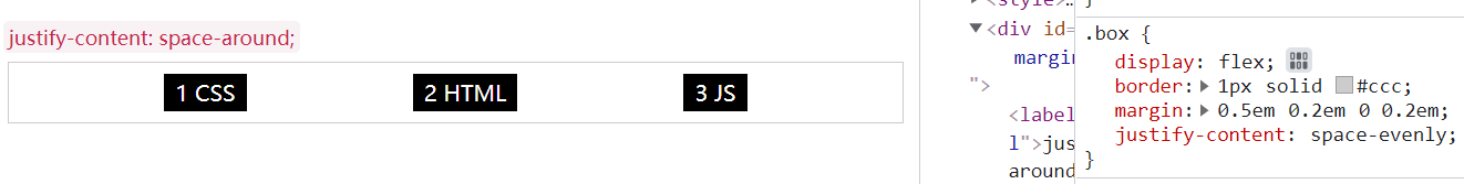
- space-evenly: 项目均匀分布,所有项目之间或项目与边框之间距离相等
示例代码如下:
1
2
3
4
5
6
7
8
9
10
11
12
13
14
15
16
17
18
19
20
21
22
23
24
25
26
27
28
29
30
| <style>
.box {
display: flex;
border : 1px solid #ccc;
margin:0.5em 0.2em 0 0.2em;
}
.item {
color:#fff;
background: #000;
padding: 0.2em 0.5em;
margin: 0.5em;
min-height: 1em;
text-align: center;
}
label {
padding: 2px 4px;
font-size: 90%;
color: #c7254e;
background-color: #f9f2f4;
border-radius: 4px;
}
</style>
<div id="wrapper">
<label for="box1" id="my-label">justify-content: flex-start; </label>
<div class="box" id="box1">
<div class="item">1 CSS</div>
<div class="item">2 HTML</div>
<div class="item">3 JS</div>
</div>
</div>
|
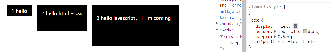
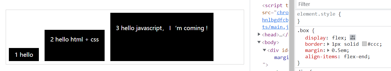
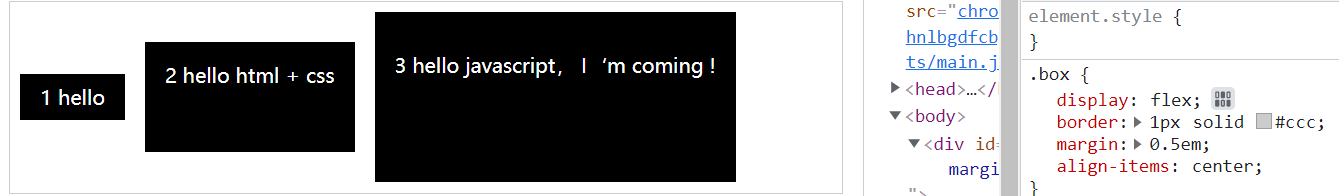
align-items
定义项目在交叉轴上的对齐方式
1
2
3
| div {
align-items: stretch | flex-start | flex-end | center | baseline;
}
|
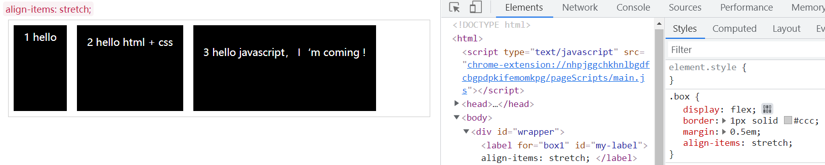
- stretch(缺省): 交叉轴方向拉伸显示
- flex-start: 按交叉轴起点线对齐
- flex-end: 按交叉轴终点线对齐
- flex-center: 按交叉轴中间对齐
- baseline:交叉轴方向按第一行文字基线对齐
align-content
定义了在交叉轴方向的对齐方式,类似主轴上justify-content的作用
1
2
3
| div {
align-content: stretch | flex-start | flex-end | center | space-between | space-around | space-evenly
}
|
参考justify-content的用法
flex属性
order
控制项目在容器中出现的先后顺序,默认是按照代码顺序排列
1
2
3
| .item {
order: integer;
}
|
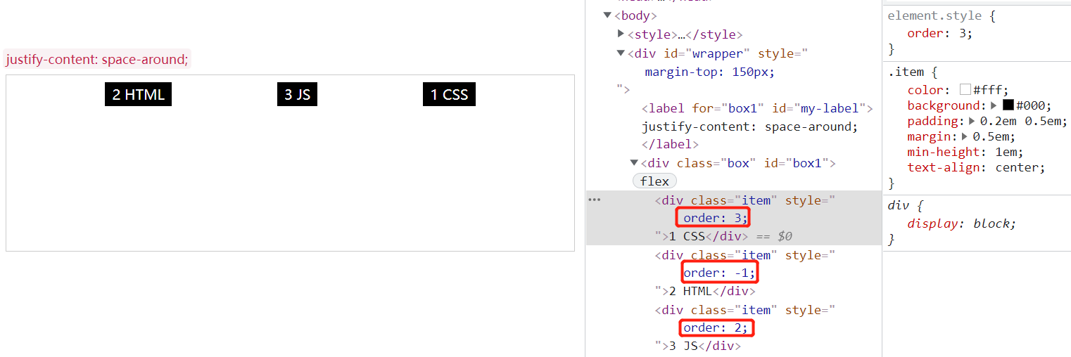
结论:按order值从小到大顺序排列,可以为负值,默认0
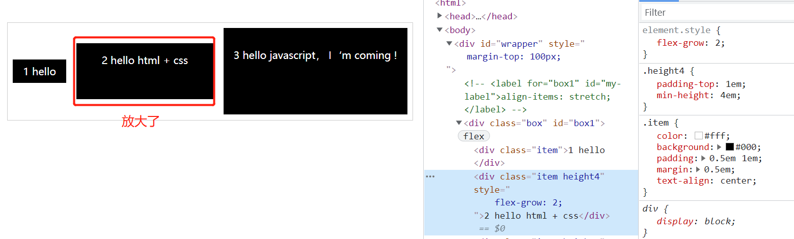
flex-grow
定义项目的放大比例, 正整数,负值无效
1
2
3
| .item {
flex-grow: <number>;
}
|
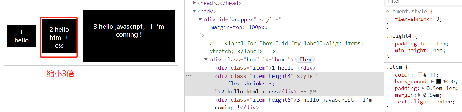
flex-shrink
定义项目的缩小比例, 默认1,0表示不缩小,负值无效,如果空间不足项目就会缩小
1
2
3
| .item {
flex-shrink: <number>
}
|
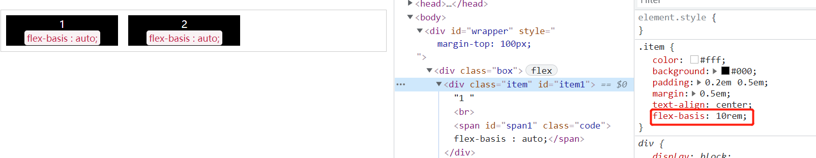
flex-basis
定义项目在分配额外空间之前的缺省尺寸(设置项目宽度,空间足够,宽度是生效的)
1
2
3
| .item {
flex-basis: <length> | auto;
}
|
flex
flex是flex-grow,flex-shrink, flex-basis的简写~
align-self
定义项目的对齐方式,可覆盖ailgn-items属性,默认auto (自定义元素自己的对齐方式)
1
2
3
4
|
.item {
align-self: auto | flex-start | flex-end | center | baseline | stretch
}
|
参考文档
Flex 布局教程:语法篇
【基础知识】Flex-弹性布局原来如此简单!!